UI/UX Work - Felt
I joined Felt during a major design overhaul and I was handed off an updated app design. After launch, I carefully analyzed the design, paying attention to user experience and functionality. With a fresh perspective, I identified areas where the user interface could be simplified and made more intuitive. Collaborating with the development team, I refined the design, incorporating feedback and iterating to create a seamless user experience.
Card Builder
The Challange
In 2020, Felt launched an overhaul to the app, moving from a landscape to a portrait experience. This update included a fully re-designed greeting card builder. Conversion from first-time user to first card sent increased by 10%. However, there continued to be complaints of confusion during card creation. An updated design was required to improve the user experience. Streamlining the navigation, enhancing the accessibility of features, and improving the overall user flow were crucial aspects to consider.
Implementing intuitive design elements, such as clear call-to-action buttons, intuitive iconography, and seamless transitions, can greatly enhance user satisfaction. Additionally, incorporating user feedback and conducting usability testing are vital in identifying pain points and areas for improvement. Striving to create a delightful and intuitive experience for customers is the ultimate goal, making their interaction with the greeting card app an enjoyable and effortless journey.
The Research
To enhance the card builder, we actively gathered user feedback through surveys, reviews, and direct communication. By listening to their suggestions, concerns, and expectations we were able to gather valuable insights to refine the card builder's functionality, design, and UI. Common complaints were not knowing how to access the available customization tools and a lack of understanding of how the printed card would arrive to its recipient.
Card Builder Version 1
Customization tools are only accessible after tapping on the selected card panel.
Updated Card Builder
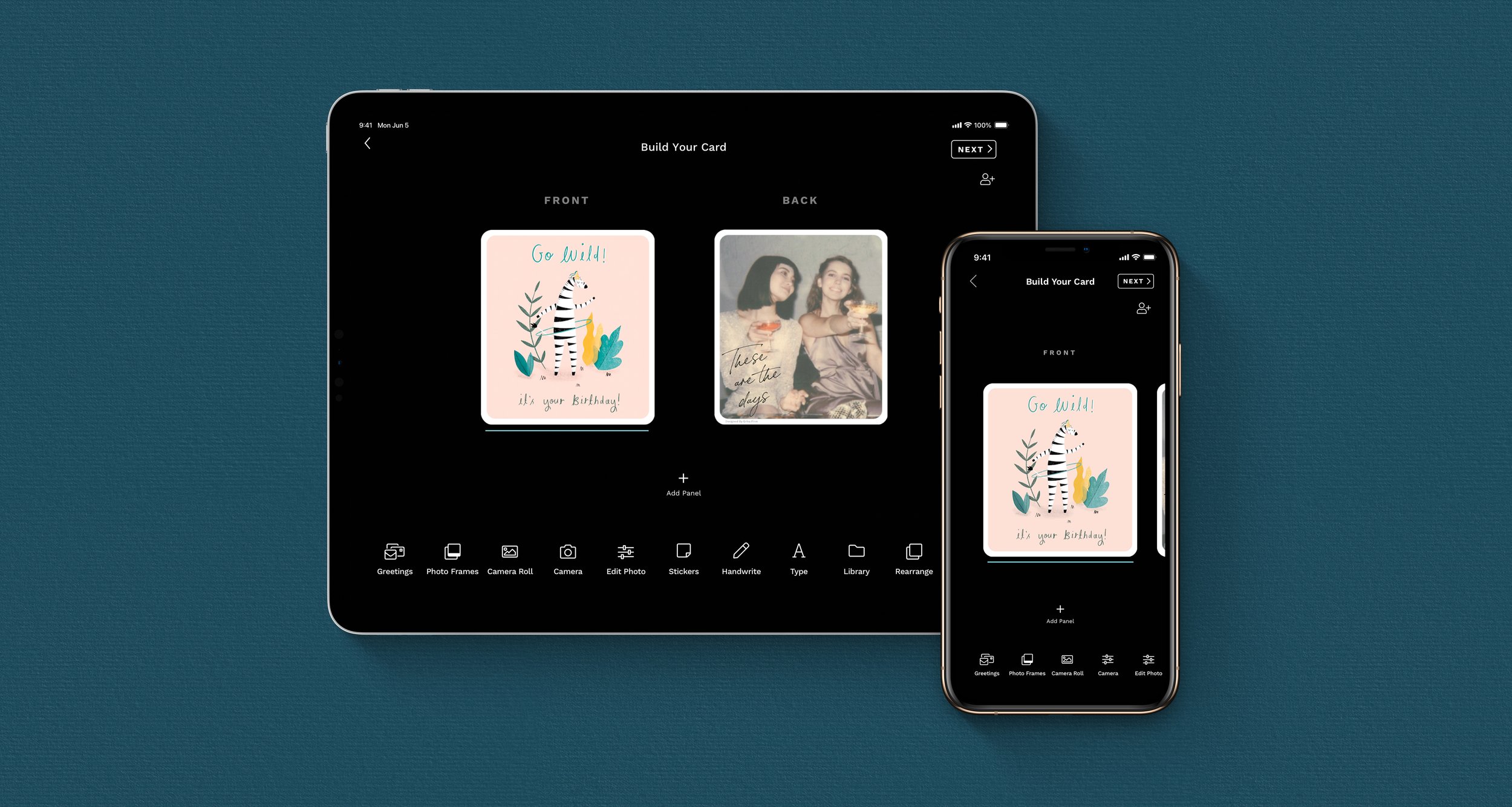
All tools are immediately accessible from a scrollable menu at the bottom of the screen.
The Solution
We relocated the card builder tools from their previous tap interaction to a more accessible and convenient location in a toolbar at the bottom of the screen. This change allows quicker and more seamless navigation, saving time and effort. We also added an “add panel” button to the screen instead of hiding it behind a kebab menu.
The unique design of Felt’s accordion card, while charming, was difficult for users to understand the final product. In order to cut down on the confusion, we added a 3D representation of how the user’s card will fold, along with a “preview” tool that shows the front and back of the folded card as it will appear when taken out of the envelope. We also added thumbnails on the back panels displaying what design would be printed on the opposite side.
Gift Selection
The Challange
After updating the card builder, it became evident that the gift selection screens also needed a revamp to ensure a seamless transition between screens. The previous layout gave too much screen realstate to the card and many of the gift products were getting lost in the dark background, making them difficult to properly showcase and mercandise.
The Solution
We removed the card preview entirely as the users arrives at the gift selection screen directly after building their card. This allowed for more gifts to be shown at a time and feel less squished on smaller phones. The new, lighter background behind the gift products now enhanced the visibility and ensured that they no longer got concealed in the darkness. This update not only enhanced the user experience but also improved the overall aesthetics of the gift selection process.
Address Book
The Challange
In 2022, we introduced the concept of “Friends on Felt.” Each user is responsible for maintaining their own address, allowing “friends” to send them cards without asking for it, and inputting it themselves. With this new addition, along with retaining a user still able to create a contact for a friend who does not have an account, we needed to overhaul the Address Book so that differentiating between the two contact types was clear and easy to understand. It was also important for users to find relevant information (such as birthdays) and easily add new contacts or find friends to connect with.
The Research:
To enhance the Address Book, a comprehensive analysis was conducted to identify the pain points and areas of improvement. Extensive research involved exploring user feedback, market trends, and competitor analysis to gather valuable insights. By delving into the needs and preferences of our users, we determined the crucial enhancements that would streamline the address book function, elevate the user experience, and allow them to find the contact they are looking for quickly.
The Solution:
To quickly differentiate between different types of contacts, we included “My Friends” and “My Contacts” section headers. Anyone other accounts a user has connected to is found under “My Friends,” and a person they have added manually is found under “My Contacts.” We also included a search bar that indexes other people with Felt accounts and anyone you have added. To help users distinguish between accounts with similar names, we display the city and state and an “address pending” state if no address has been added.
In our research, we identified that users want to quickly see upcoming birthdays and organize their contacts into lists for different types of card sending. To make these wants easily accessible, we included three tabs in the Address Book. The first “contacts” houses the above “My Friends” and “My Contacts” lists along with a “Recents.” In the “Birthdays” tab, users can see a chronological list of upcoming birthdays along with a countdown of the days remaining. The “Lists” tab allows users to create their own groupings of their contacts. They have the option of starting a card that will go to everyone on the selected list from the address book or by choosing it while in the envelope screen of the card builder.
Felt Bomb
What it is:
On special events, like a loved one’s 50th birthday, we want to celebrate in a way that lets that special person know they are loved by many. We created Felt Bomb to allow a person to organize friends and family, each creating their own card and sending them all together so that they fill the recipient’s mailbox and home with love.
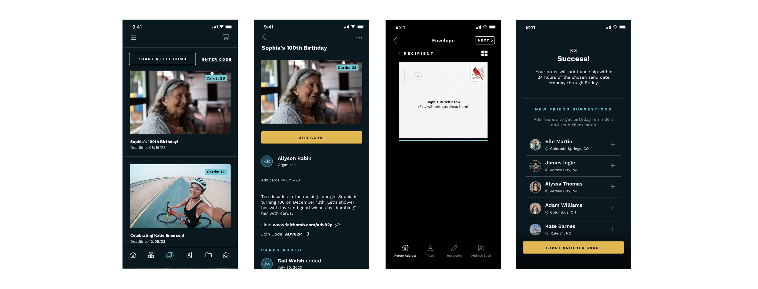
Felt Bomb works by a Felt user adding the recipient’s address, selecting a mailing date, adding a budget (if desired), and then sending an invite link to their friends. Friends will then download Felt, be taken directly to the Felt Bomb to add their card, and we hold them so that they mail on the same day and arrive together.
Research and Ideation:
We looked at GoFundMe, and its competitors to research what they were doing well and what could be improved upon in the Felt Bomb creation flow. One of the most important aspects we found was allowing users to tell the story of their Felt Bomb through images and descriptions. We needed to get users through each step without any one screen feeling overwhelming. I designed a few user flow options for the creation flow before we landed on an MVP to present to users in one one-on-one interviews.
The Feedback:
When conducting user interviews, a few needs became clear. Users were concerned their friends would have trouble finding the Felt Bomb they were invited to, they were unclear how their budget translated to the number of cards able to be added, and they wanted reassurance that the recipient’s address would not be made public.
The Solution:
I iterated on the MVP design to incorporate the needs we identified from our feedback. We added the ability to join a Felt Bomb with a code or link. Once the link is tapped, the Felt Bomb is visible at the top of the home screen. We also included Felt Bombs being either public (findable by any Felt user) or private (requiring a link or code). To clarify how the budget works, we added a text explaining how many credits equal a card. Finally, we included a preview screen of how the envelope will appear to users joining a Felt Bomb so that the creator is reassured the address will not be visible.


